The histogram on your camera is a visual representation of the exposure levels in a photo. It helps you understand how light or dark different parts of your image are, so you can adjust your settings for a better exposure. Here’s a breakdown of the basics:
- What the Histogram Looks Like
- The histogram is a graph with a horizontal axis and a vertical axis.
- Horizontal Axis: Represents the brightness levels in your photo, from dark to light:
- Left Side: Shadows (blacks).
- Middle: Midtones (grays).
- Right Side: Highlights (whites).
- Vertical Axis: Shows how many pixels in your photo are at each brightness level. Higher peaks mean more pixels at that level.
- What a “Good” Histogram Looks Like
There’s no one-size-fits-all perfect histogram because it depends on the scene you’re photographing. However:
- Balanced Histogram: Often peaks are spread evenly, with no extreme spikes at the edges. This works well for most situations.
- High Key (Bright Image): Peaks shift toward the right, indicating more highlights.
- Low Key (Dark Image): Peaks shift toward the left, indicating more shadows.
- Common Issues to Look For
- Clipping:
- Highlights Clipping: If the graph touches or spikes on the far right, you’re losing detail in the brightest areas, which turn pure white.
- Shadows Clipping: If the graph touches or spikes on the far left, you’re losing detail in the darkest areas, which turn pure black.
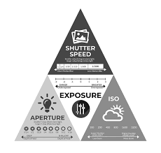
- To avoid clipping, adjust your exposure by tweaking shutter speed, aperture, or ISO.
- Using the Histogram
- Review Exposure: After taking a shot, check the histogram to see if it matches your intent. For example, if you’re shooting a bright, snowy scene, expect the histogram to lean toward the right.
- Adjust Settings:
- If the histogram is too far left (underexposed), increase exposure by:
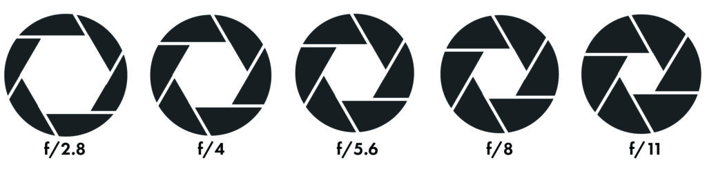
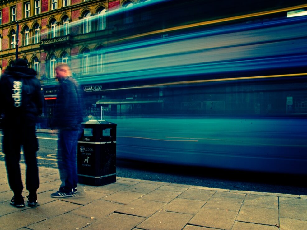
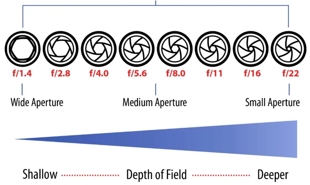
- Slowing the shutter speed.
- Widening the aperture (lower f-number).
- Raising the ISO.
- If the histogram is too far right (overexposed), decrease exposure by:
- Speeding up the shutter.
- Narrowing the aperture (higher f-number).
- Lowering the ISO.
- If the histogram is too far left (underexposed), increase exposure by:
- Practice Makes Perfect
- Use your histogram to fine-tune exposures until it becomes second nature. Compare how the histogram changes with different lighting and settings to see how it aligns with creative goals.
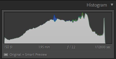
A good, balanced histogram typically looks like a smooth, bell-shaped curve that doesn’t have spikes touching the far left (shadows) or far right (highlights). Here’s what it usually indicates:
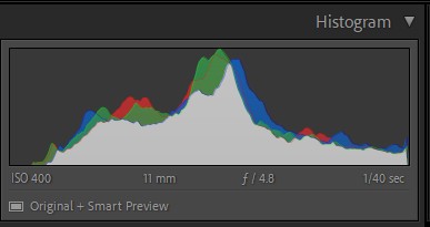
Key Features of a Balanced Histogram:
- Shadows (Left Side):
- The graph tapers off as it approaches the far left.
- There are no big spikes touching the left edge, meaning you’re not losing detail in the darkest areas (no blocked shadows).
- Midtones (Center):
- The peak of the curve is often in the middle, representing a lot of detail in the midtones (the “average” brightness of the image).
- Highlights (Right Side):
- The graph tapers off as it approaches the far right.
- There are no big spikes touching the right edge, meaning you’re not losing detail in the brightest areas (no blown highlights).
What a Balanced Histogram Means
- Proper Exposure: Your image has a good range of tones, from shadows to highlights, without clipping.
- Detail Preservation: Most areas of your photo retain their texture and details, making the image more visually pleasing.
- Neutral Composition: Works well for general scenes like landscapes or portraits under normal lighting.
Example Scenarios for a Balanced Histogram:
- A landscape photo with a bright sky, dark shadows in trees, and plenty of midtones in grass or water.
- A portrait lit with soft, even lighting, where skin tones are nicely exposed.
Important Notes:
- Scene Dependent: A balanced histogram is ideal for evenly lit scenes, but some situations, like high-contrast scenes or creative choices, will lead to unbalanced histograms. For example:
- Dark, Moody Images: The histogram might lean left.
- Bright, Airy Images: The histogram might lean right.
- Not a Rule: Use it as a guide rather than a strict rule. The look of the histogram depends on your artistic intent.
Histograms can vary significantly depending on the scene and the style of photography. Below are examples of how histograms look in different scenarios and what they mean.
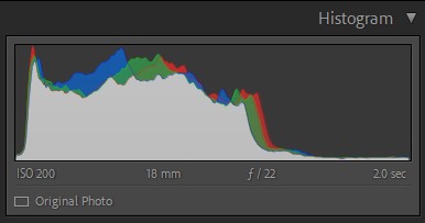
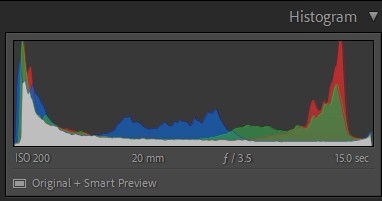
- High Contrast Scene
Example: A bright sunset with dark shadows in the foreground.
- Histogram Shape:
- Peaks at both the left (shadows) and right (highlights), with a dip in the middle (midtones).
- Looks like a “camel’s hump” with two peaks.
- What It Means:
- The image has very bright areas and very dark areas with minimal midtones.
- This is common in high-dynamic-range (HDR) scenes where you might need to use bracketing or post-processing to recover detail.
- How to Adjust:
- Use exposure compensation or bracket your shots to capture shadow and highlight details.
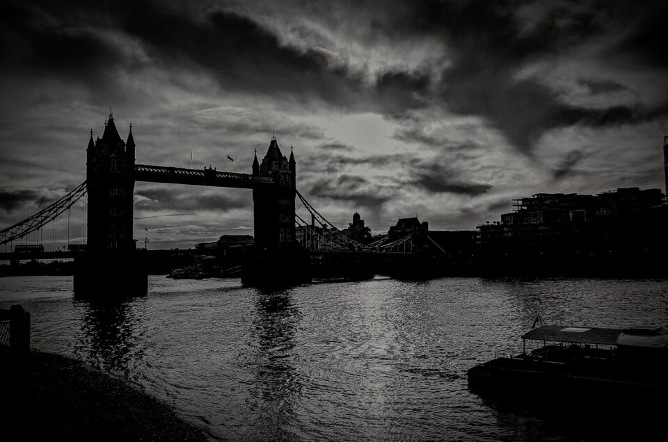
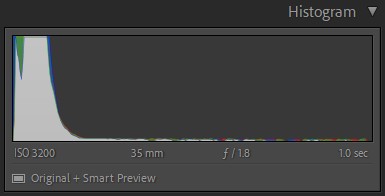
- Low-Key Image
Example: A moody portrait with deep shadows and minimal bright areas.
- Histogram Shape:
- Peaks concentrated toward the left (shadows).
- Few, if any, pixels in the highlights or bright midtones.
- What It Means:
- The image is intentionally dark, with shadow details dominating.
- How to Adjust:
- This is often intentional, so as long as your shadows aren’t clipped (spike at the far left), you’re good.
- High-Key Image
Example: A bright and airy photo of a snowy landscape or a white background.
- Histogram Shape:
- Peaks concentrated toward the right (highlights).
- Few pixels in the shadows or dark midtones.
- What It Means:
- The image is predominantly bright, which can create a soft, clean look.
- How to Adjust:
- Ensure highlights aren’t clipped (spike at the far right), especially for subjects like snow or white clothing.
- Underexposed Image
Example: A night shot or an incorrectly set exposure for a darker scene.
- Histogram Shape:
- The graph is bunched up on the left with minimal midtones or highlights.
- What It Means:
- The image is too dark, and you’re losing detail in the shadows.
- How to Adjust:
- Increase exposure using a slower shutter speed, wider aperture, or higher ISO.
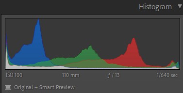
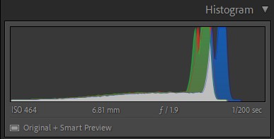
- Overexposed Image
Example: A brightly lit scene with blown-out skies.
- Histogram Shape:
- The graph is bunched up on the right with minimal shadows or midtones.
- Highlights may clip (spike at the far right).
- What It Means:
- The image is too bright, and you’re losing detail in the highlights.
- How to Adjust:
- Decrease exposure by using a faster shutter speed, narrower aperture, or lower ISO.
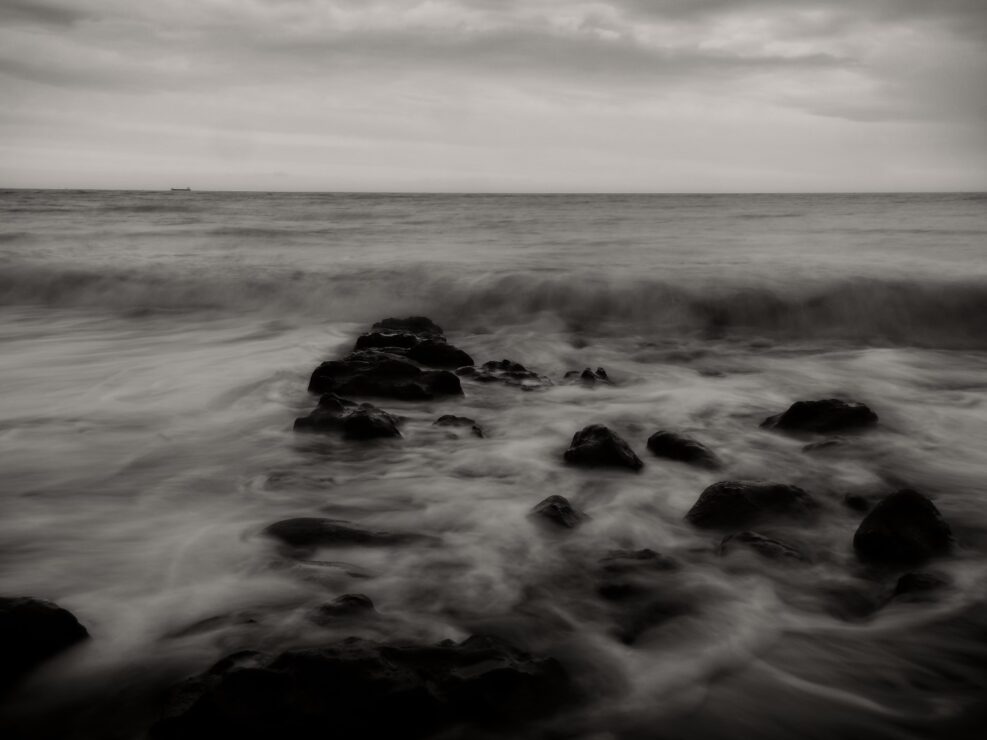
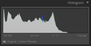
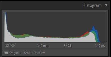
- Flat/Low-Contrast Image
Example: A foggy day or evenly lit, low-contrast portrait.
- Histogram Shape:
- Peaks are concentrated in the middle, with little data on the far left or right.
- What It Means:
- The image has limited contrast, and most tones fall in the midtone range.
- How to Adjust:
- Add contrast in post-processing to stretch the histogram and enhance detail.
- Clipped Shadows and Highlights
Example: A poorly exposed image with both dark and bright areas losing detail.
- Histogram Shape:
- Spikes at both the far left and far right edges.
- What It Means:
- The image has lost detail in both the darkest and brightest areas.
- How to Adjust:
- Reduce contrast by adjusting exposure or dynamic range settings (if your camera has them).
Summary of Histogram Use:
- Balanced Scenes: Aim for a smooth, spread-out histogram without spikes at the edges.
- Creative Choices: For low-key or high-key images, the histogram will naturally lean left or right—just avoid excessive clipping unless it’s intentional.
- High Contrast: Consider techniques like bracketing or post-processing to manage extreme histograms.